The white construction walls made to block out noise from the building of the new science center by Rood Hall are now filled with posters created by the contemporary photo practices class.
AN INSTALLATION PROJECT
Each semester the contemporary photo practices class has an installation project, such as the projections on the Student Union Building completed last year. The project ideas began with a blue sky brainstorming session in which all ideas were discussed, then categorized and voted on, said Kurt Simonson, associate professor of photography.
“[The installation project is] a normal part of the curriculum anyway, but then this big wall showed up … so from the start of that news we were like ‘well that’s going to be miserable so we need to do something about that,’” Simonson said.
The posters cover two sets of walls, one of which faces the courtyard and has vector illustrations of the trees which were once there. These illustrations were made from images Simonson took in the fall and then formed in Adobe Illustrator to look more like a painting.
“I think they reflect the trees in the middle of the Rood buildings so [it] like gives hope that those trees are going to become more obvious again soon,” said Ayla Carvey, junior communication sciences and disorders major.
MOST COLORFUL, LOUDEST AND WEIRDEST
Daniel Lambert, senior business major and art minor who photographed some of the images for the posters, also enjoys the tree illustrations.
“The trees that are put on the outer wall are just kind of nice…so you kind of walk in and just, ‘ooh’ kind of wonderful to look at,” Lambert said.
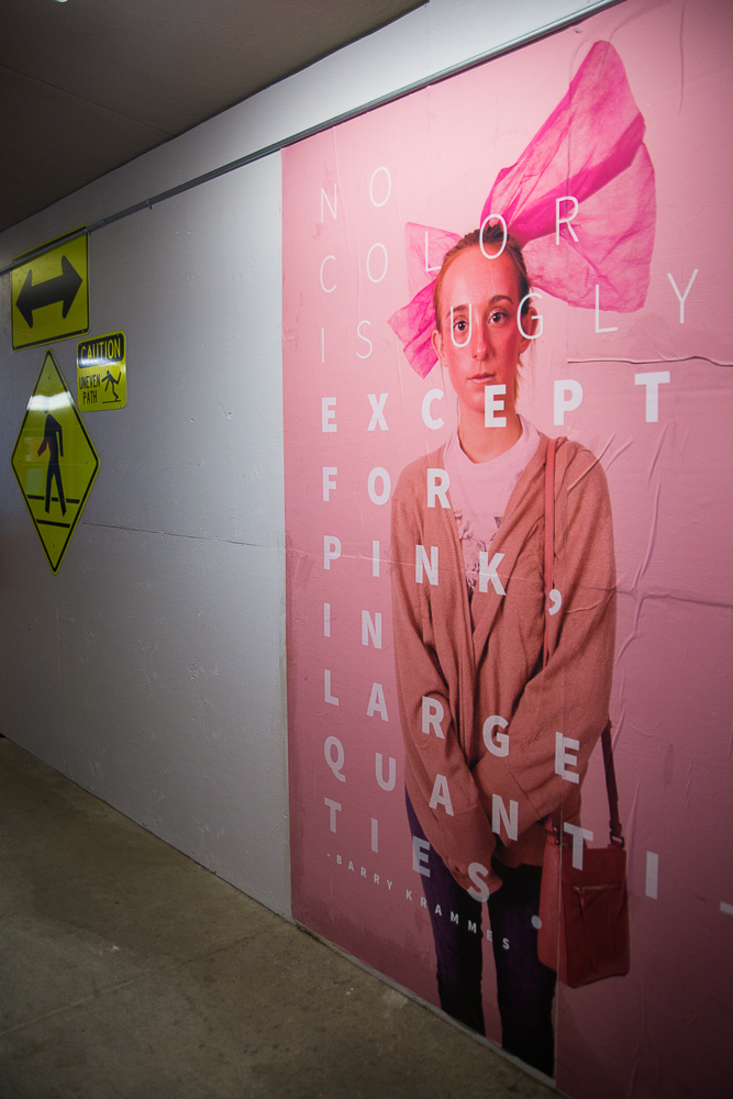
The second wall of posters is outside the Rood art classrooms and contains photos with art major jokes written over them. The inspiration for these posters came from advertisements in a New York subway tunnel, Simonson said.
“My favorite might be the one about pink, that no color is ugly except pink in large quantities. I came up with that quote from a thing that Barry Krammes used to always say,” Simonson said. “When I was a student, he used to scream that at people and say that to people. … It is also the most colorful, it’s the loudest, it’s the weirdest.”
CONTINUE TO EVOLVE
Some of the other posters include quotes from Jonathan Anderson, associate professor of art, and a picture of a Starbucks cup with art major written as the name on the cup.
“I enjoy the Starbucks one cause I’m probably going to get a job at Starbucks after college, so that one just kind of hits home a little bit,” Lambert said.
The project will continue to evolve with other art classes, including integrated design III and painting III, as students seek to incorporate more elements into the wall.


