
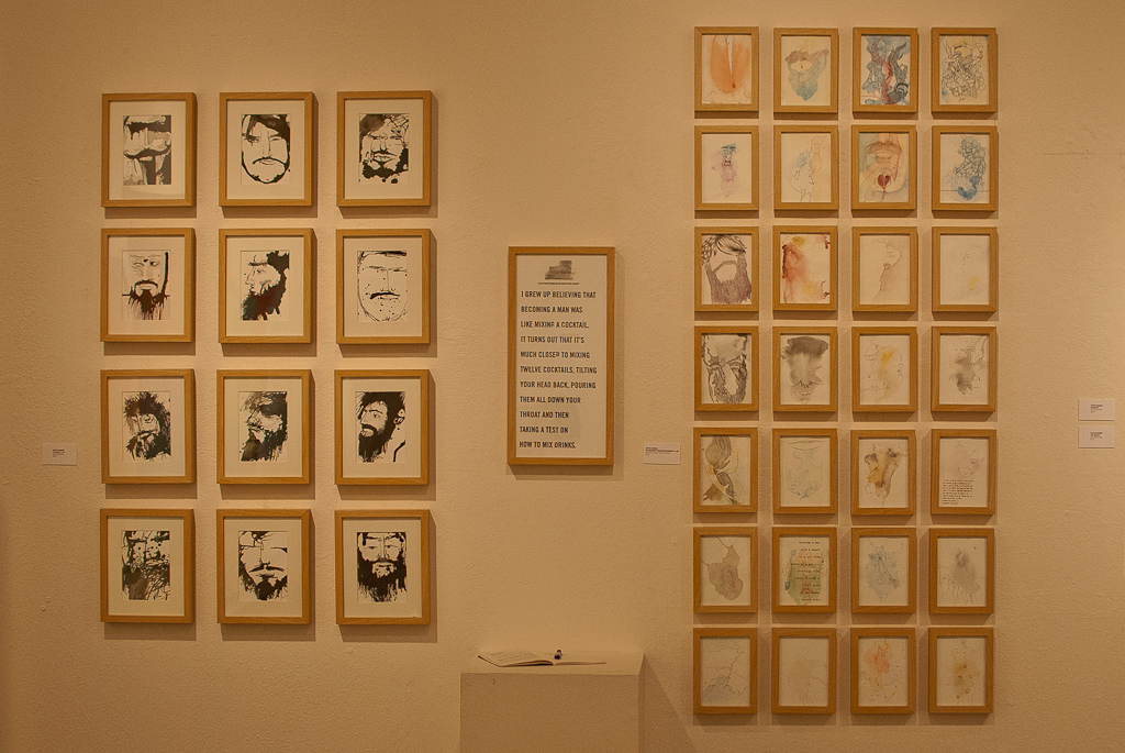

Senior Austin Ranson primarily used ink and watercolor on paper to express his theme of exploring definitions of masculinity. | Olivia Blinn/THE CHIMES
Four students filled the walls of the Biola Art Gallery with new and original artwork this week: Brooke Cantu, Jana Harrison, Matt Perdue and Austin Ranson. Each of these seniors has compiled a set of work to display as their senior thesis show, a task for every Fine Arts Major before graduating. Gallery openings have occurred every Monday throughout the semester, and next week will be the conclusion to several months worth of senior shows.
Cantu, 23, is a graphic design emphasis from Miami, Fla. who created an installation pairing music with color in her show titled “Gravisque.”
Q: Where did the title of your show originate from?
A: Gravisque is a word in Latin that isn’t really translated well into English, and it means several things. It means heavy, loaded, pregnant, deep, dignified; all those things together.
Q: What was the process of your show?
A: I got the word ‘gravisque’ from the music I originally translated. So I found a score of music — it was a hymnal by Eric Whittaker. I took each note of the music and converted the frequencies to wavelengths of light, which add color, so there’s a direct, mathematical calculation for every color I’m using in the piece based on every note in the music, including silence. … From there, I took the colors and tried to stay as true to them as possible, but still making guttural decisions about the aesthetics of it and how the colors work together, and what colors would go next to which, and then creating these experimental posters out of that. To me the piece is not just about music and light. The piece is about data and the beauty that can be found in data, and when you really look at these calculations it can be something really beautiful and you can discover something new and experience something you’ve already experienced in a completely different way. So to me that sums up in the word ‘gravisque.’ There’s kind of this underlying weight, this depth, this beauty … and that being found in data, and data in and of itself is this deep thing that can be experienced.
Q: Where did you draw your greatest inspiration?
A: The idea first came when I was in David Turner’s class, philosophy of aesthetics. He started talking about how we know things, and he was mentioning how we can know color. He said you can know the wavelength of color, and I had never thought of that before. And I was like, ‘Oh man, I need to know the exact measurement of my favorite color!’ I don’t know why I needed to know that. So I started doing research and then I just kept having this image in my mind, like totally random, of a musician playing color, like it was in the back of my mind. So I was just like, ‘I think I’m going to explore this a little bit.’ So I started exploring, and I just kind of stumbled upon a few things, and picking the song took a while. I’m already familiar with the genre of info graphics and data visualization, and I guess information aesthetics, so I think coming up with that solution for something I was discovering was seamless.
Q: What has been most challenging?
A: I think it was most challenging to find a form that I found most fitting to the piece and to the process with the resources and the time and the budget that I had. So originally I was planning on doing something a bit more grandiose, but, you know, you have to be realistic, and so I think that was probably the biggest problem. It’s still kind of a problem that I’m trying to work through.
Q: What is your greatest take away as a Biola art major?
A: Well, I think that my greatest take away has been understanding and striving, well, striving, but not alone … with the Lord and with the Holy Spirit. Kind of just this understanding of our role and our purpose within the world to cultivate all of creation, to bring glory to God. That being something that we have so much freedom and liberty in, and that not necessarily being subject to our cultural ideas or anything, but it really being something that God desires — that we create, and that we create with him, and so that the world can see how beautiful he is. I think that’s probably been the biggest thing — understanding art and the role of art and how we as Christians can speak into that.
Harrison, 21, is an interdisciplinary emphasis from Walnut Creek. Her show, “Surfaces of Expression,” deals with themes of human expression.
Q: What would be a brief description of your show?
A: It’s showcasing the prototype for an app for kids with autism to learn facial expressions better. The show is supposed to help you, if you don’t have autism, be interested in facial expression and why we don’t know more about them, which is interesting … kind of highlighting how universal some of them can be.
Q: What medium did you work in?
A: I did chalk board drawings! I used white chalk for the diagrams, and then indicated what muscles and movements were going on. And then the app itself is an iPad app and Xcode.
Q: What is your greatest ‘take away’ as a Biola art major?
A: I think how interdisciplinary the program is, thinking about art from a broad standpoint. What I really liked about the project I was doing is that you could use art for a lot of different purposes, for something like art therapy, so you can learn about almost anything and be conveying it visually.
Perdue, 22, a design emphasis from San Jose, plotted fields of data points in nails and strings in his show, “The Beautiful Data.”
Q: Give us a brief description of your show.
A: It’s about information aesthetics and how the art community sort of discovered this open playground about visualizing information for the sake of aesthetics … how we can facilitate information itself to be an artist and sort of determine the form or shape of any visual metaphor for its own meaning. Essentially, visualization information is a means of taking abstract information and giving it an effective visual metaphor so we can understand it without having to read all the numbers of the information … I decided to have fun and I used traveling the soccer ball as the means of information. So essentially this entire piece is based on where the soccer ball traveled.
Q: How did you record where it traveled?
A: I watched a soccer match thoroughly and I used the field lines as points of reference and I digitally mapped it out on a grid.
Q: What medium would you consider this?
A: Installation I suppose. You know, it’s temporal because you have to take it down.
Q: What was most challenging?
A: [The] biggest challenge was thinking on your feet when things don’t work out. I had a mini crisis with my materials that didn’t come in on the day I was supposed to install, so I just had to think on my feet and rethink what’s the best way to stick to the core idea of the data and let the data be the piece itself.
Q: What is your greatest ‘take away’ as a Biola art major?
A: The greatest take away is that you know, crisis, or anything bad that happens or anything … the pressure is what brings out the real artist in you. That was something friends encouraged me of, they told me that from their own experience. I worked within my own means with what I knew I could accomplish. I just stuck to the core of my show … trial by fire.
Ranson, 25, a drawing and painting emphasis from Mission Viejo did his show, “99 Beards on a Wall: Men, boys, and monsters, I have been known and worshipped,” surrounding ideas of masculinity in the 21st century.
Q: What is your show about?
A: So basically my project started out kind of as an exploration of cultural versus biblical versus ideas of masculinity in culture in those areas. … What it’s become is an exploration of how I personally as a man view masculinity. How am I informed by these ideas in culture and in the Bible, and I’m looking at that through the lens of people that I’ve known and people that I aspire to be like. And I guess for the most part I’m using mediums that deal metaphorically with the ideas behind masculinity.
Q: What medium did you work in?
A: Mostly I’m working with watercolor and ink, the watercolor obviously being more of a fluid, untamed medium, and also having some sort of connotations with the feminine. You have within the last 300 years, women who are the watercolorists, and then you have the men who are more like Jackson Pollock, who are these abstract Expressionists who are almost kind of chauvinistic, so I’m playing within those boundaries. My work is very expressionistic and the line work that I use typically looks masculine, so trying to play within those bounds… something that is untamed but also kind of feminine, and something that’s more structured and defined and discovering the tension between those two things, which I think somewhere in there is a good metaphor for what it’s like to be a 21st century man.
Q: Where did you draw your greatest inspiration?
A: Well I’ve read a lot of the work of Robert Bly and he talks a lot about what it means to be a man in our day. He wrote a book called “Iron John” which I guess has been out for about 20 years, and maybe we’ve progressed a little bit culturally since then to a fuller view of masculinity, but I don’t think we have by and large; I think we are going around in circles, but he has a lot of good things to say. As far as the work that inspires me, I spend a lot of time actually looking through art history. A lot of my compositions are actually based off the work of Botticelli and Michelangelo; I mean, you would never know that unless I told you exactly how those were, because my work’s very abstract in comparison. But I’m definitely drawing from a pool of these men who were kind of a big deal in their time, and still are really.
Q: What was most challenging?
A: I think the most challenging thing has been just getting to a point where I knew what I was trying to say, because I started with this big idea – I was really responding to problems in the church and how we view masculinity and just kind of taking these cultural ideas and tagging scripture to them, like this is what God wants you to be, and I think that’s really problematic. I know a lot of great men who don’t fit the cultural norm. So I guess it started with wanting to affirm men as men, and then has evolved into realizing that maybe I don’t know what it means to be a man. So I got to a point where I was mostly just making work that is asking a question, trying to figure out what it means to be a man. Or maybe just working within this grid of what I think it’s supposed to be and trying to see how everything works together in all that.
Q: What is your greatest ‘take away’ as a Biola art major?
A: I think I’ve been really blessed to get to know a lot of really fantastic professors who have helped me grow as a person, spiritually as well as artistically. And this show has kind of been the culmination of all that, being able to take what I’ve learned and apply it to a project that I’ve never had of this magnitude, or anything really similar. So it’s been stretching and I’ve learned a lot. I think over the course of my time here, which has been long, I have become a much more full person than I would have at any other art institution.