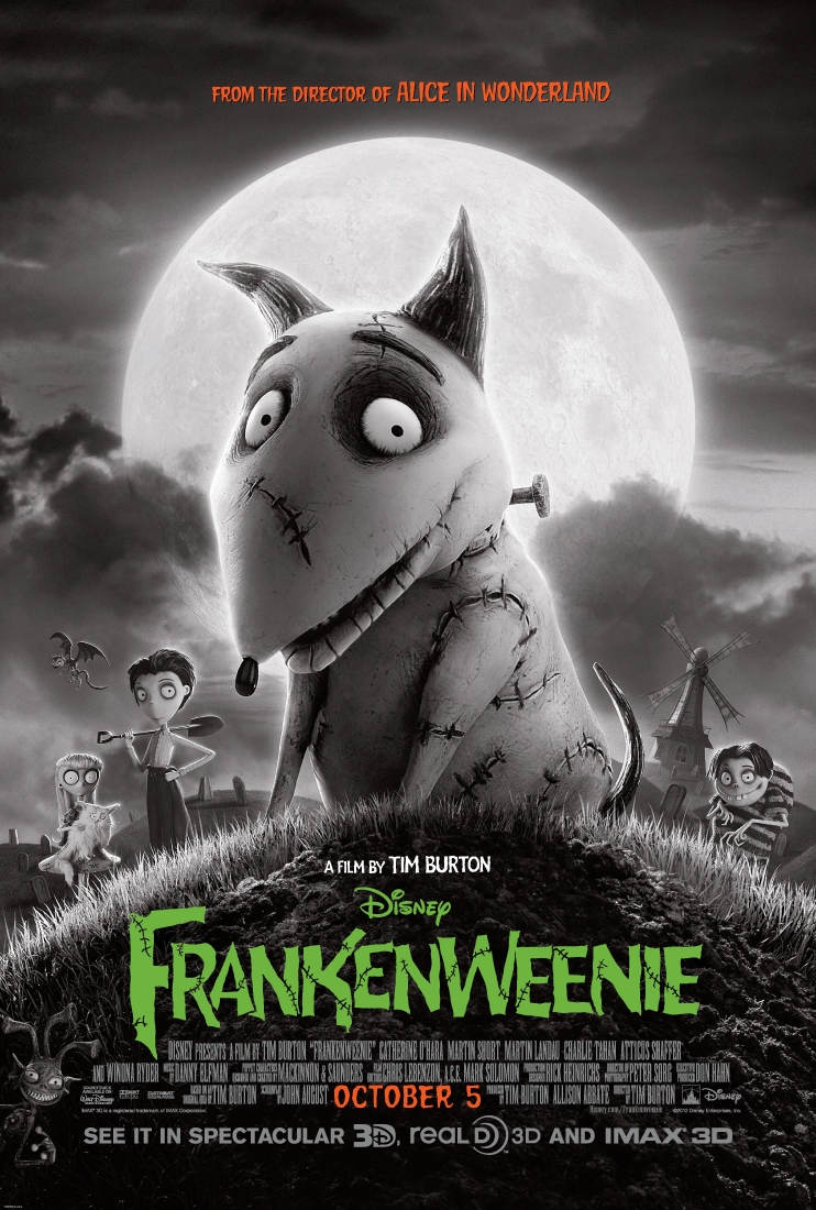
Tim Burton’s remake of his short film “Frankenweenie” debuted around the country this weekend, and I hope for his sake there was a crowd somewhere. It certainly wasn’t at the Krikorian Theater in Buena Park, where I joined an audience of six people in a theater that could seat around 500, according to the very nice ticket-taker wearing a bow tie. Having never viewed the 1984 version, I cannot comment on Wikipedia’s assertion that Disney fired Burton because the pricey short was too scary for children; however, the 2012 model is definitely too dull for adults.
The kid-flick fails to engage adults
When the premise of a film is so simple and obvious now that we’ve all seen the trailer, you need to get there quickly. It took ages for the dog to die. That sounds absolutely terrible, but you need to engage your audience quickly or they squirm for 40 minutes waiting for the inevitable.
The plot contained about a dozen conflicts, so many that viewers couldn’t care about any of them. It touched on the battle of kids choosing books or sports, but cast that aside in favor of the morality of bringing something dead to life — only to abandon that for a rant about the “heart of science” that just went against all scientific fact.
Whatever creepy elements concerned parents in the old “Frankenweenie” weren’t in this one. 2012’s “Frankenweenie” is one of a triad of animated “horror” films this season. While I haven’t seen “Hotel Transylvania,” “ParaNorman” was legitimately frightening at the end. Depending on the child, I would think twice about renting that one. In contrast, “Frankenweenie” was completely tasteful and appropriate for all ages. It had some tense moments, but they were playfully done.
Film is no different than previous Burton movies
As a fan of the wildly popular “The Nightmare Before Christmas” and even of the less-popular “Corpse Bride,” I wanted Burton to succeed. But despite my fondness for his previous work, even I had to regard the previews for this film with a resigned, “Again, Tim?” So I went into this film hoping against hope he had a new revelation, a valid reason for revisiting the haunted stop-motion horse Burton first created and continued to beat long after it was dead.
Unfortunately, very little about this film was original. Burton’s love affair with stop motion isn’t even the problem; it’s the obsession with the exact same stop motion. The characters are always creepy, the motifs always quirky horror, the faces gaunt and the bodies weirdly proportioned. Traditional animation has incredible breadth — from the classically beautiful, hand-drawn Disney princesses, to computer-generated “Toy Story,” to intentionally-stylized television like the surprisingly clever “Phineas and Ferb” — but Burton has failed to create any range in stop motion. Every film looks exactly the same.
Another random similarity is that the protagonist of “Frankenweenie” is named Victor (Charlie Tahan), the same as the main guy in “Corpse Bride.” Harping on the small things may seem petty, but I can’t help but view them as lazy, recycled, vanilla. It is beginning to feel as though Burton created this wonderful art style but couldn’t decide on a story, so he just chose all the plots and is cranking them out, one by one.
Black and white combines with 3D for stunning visuals
Admittedly, “Frankenweenie” did have two elements its predecessors did not: 3D and a black and white color scheme. I usually regard 3D as a very expensive headache that instantly destroys the ability to take a film seriously — which means an animated kid-flick is exactly its place. I can honestly say, for the first time in my life, I felt the 3D added something to this movie. It made me look harder at the animation, study the environment more carefully, and I liked what I saw.
In fact, the 3D was enhanced by the black and white color scheme. As a movie-goer born in the 90s, I see color as the default and black and white as the exception. But the old-fashioned throwback fit the mood of the story, not just because it was a kid’s “horror” movie, but because it harkened back to “Frankenstein.” The 3D made the black and white more visually stimulating.
Combine good visuals with a complete lack of originality, a handful of erratic Asian stereotypes and the just-plain-gross factor of playing with a dead dog, and you get the weakest adaptation of “Tim Burton’s Stop-Motion Kid’s Horror Film Starring a Gaunt Male with Skinny Legs.”


